
Your Photoshopping sews socks that smell.
Yeah, sure, Poe once said “There is no exquisite beauty…without some strangeness in the proportion", but this slovenly digital Hydrocephalism isn’t that.
This is just awful.
Amateurish.
And, most importantly, entirely avoidable.
So consider this your…iconogenitory intervention, because this is just embarrassing. I mean, you laid out seriously Big Cake to buy yourself a top-shelf blog. Popped for the Mark Levinson Lexus LS 430 sound system. Killer rims. The Guerlain’s KissKiss Gold and Diamonds Nipple Rouge.
And you get people like Alec Baldwin, Barack Obama, Walter Cronkite, Peggy Noonan, Jim Webb and most of the rest of the celestial chorus of Left, Center and Right Blogistan to write for you.
You’ve got Best Selling-book income. Speaking-gig income. Blog-ad income. And whatever you have left from the divorce.
And yet for all of the vast resources at your command,
you can't do better than this?
The story itself –
Microsoft Wants To Deal With New Yahoo Board, Yahoo Doesn't Want A New Board
Huffington Post | July 7, 2008 11:38 AM
Read More: Carl Icahn, Jerry Yang, Microsoft, Microsoft Yahoo Merger, Steve Ballmer
Carl Icahn's saber just got louder. The Associated Press reports that Microsoft has indicated that it would be interested in negotiating a deal with Yahoo once more if there were a new board of directors. The deal could include Microsoft buying just a portion of Yahoo, such as the search engine, or even buying the whole company if need be -- now likely at a steeply discounted price, after Yahoo's stock plummeted last week.
Microsoft Corp. threw its weight behind investor Carl Icahn's effort to oust Yahoo Inc.'s board next month, saying Monday that a successful rebellion would encourage the software maker to renew its takeover bid for Yahoo or negotiate another multibillion-dollar deal.
…
-- I could care less about.
But the “art” is a fucking disgrace.
Look, I have no formal training in graphic arts. None. And my first Photoshop efforts were, well,

nothing to blog home about, but shit, Arianna, I’m just a leeeeetle fella and I’m actually mortified for you. So as a public service to all the young ballplayers out there, let's break this failure down into coachable moments.
First, the web is a Visual Medium, so pick your palette accordingly. If you want to convey face-to-face conflict, pick some images where the story is already clear, sight-lines are clean and the choreography simple.
For example, would the average reader out there even catch on that the foundation for your graphic was this vid capture from

“West Side Story”?
I sure didn’t.
Second, pick a scene that matches the faces you have to work with and, where possible, pick versions of faces that line up with the scene you have chosen. If you don't, you're going to end up with the rampant Mr. Potatoheadedness that helped to ugly up the HuffPo pic.
Third, don’t clutter your scene with unknowns. This pic includes four paste-in characters, three of which are unfamiliar to the average reader (Hell, even Mrs. Ichan couldn’t pick Carl out of a lineup) and one of which -- Susan Decker –- isn’t even mentioned in the damn story.
To convey a narrative's underlying tension when the story is somewhat complicated and unfamiliar (as it is here), stick with a visual with a dramaturgically-supportable maximum of Two Characters in Conflict.
Fourth, if Steve Ballmer is one of the characters in the story, you are required to use him. Because,
A) Along with donating your organs to Microsoft high-dollar shareholders, its one of the terms buried in the ultrafine print of the license agreement you already unwittingly consented to when you last used Windows.
B) It'll save you work (Ballmer comes ready-made-out-of-the-shower as a big, loud cartoon.)
Fifth, get some fucking talent on the job.
For example, using only exactly those poorly selected raw materials your own Photoshopper used

(found on teh internets and composited above by me with about five minutes of well-defined searching from a regular, public workstation) and forty minutes using a laptop in a dim bar, skating my mouse between peanut shells and beer spills, here’s what modest skills can rough out:
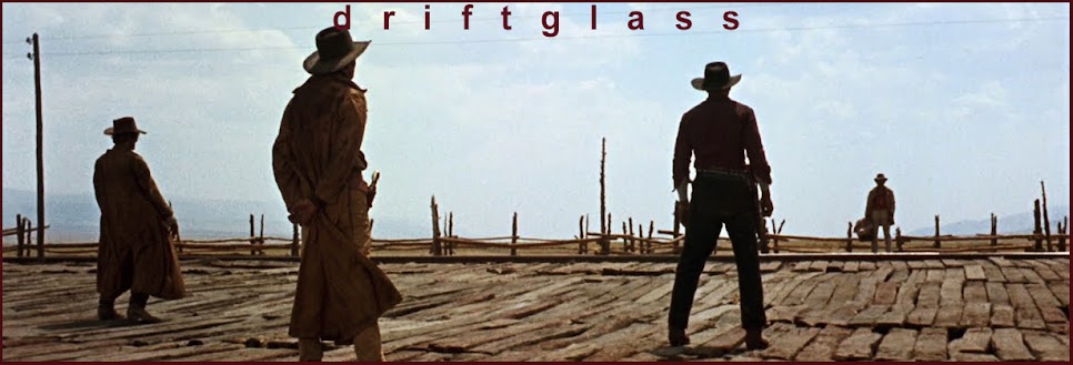
If you want to relate blunt, face-to-face conflict, how about a little something from

"Inherit the Wind"?
Or perhaps "Reservoir Dogs"

would be a more relatable choice of visual shorthand?
And without doing the Photoshopping, surely anyone can see that

"12 Angry Men" would have made a much better, livelier selection.
Given your high profile, Arianna, and the resources you can bring to bear, there was no excuse for this shoddy workmanship; America’s coffeehouses, gentlemen's clubs, call centers, boxcars, and community college faculty lounges are full of unemployed and underemployed pixelslingers whose services are available for very reasonable rates.
Hell, available for reheated pizza and a pot of decent coffee.
Seriously, Arianna, how about bringing the visual content of your blog up to the same world-class professional level as the written content?
And to get you started in the right direction let me point you towards the proven graphic talents of these extremely gifted and politically-savvy artists:
Lower Manhattanite of the Group News Blog.
Mark Hoback at The Aristocrats
And Darkblack over at Darkblack
I guarantee you'll be very glad you did.


17 comments:
*snaps*
like word drifty.
fucking word.
I figured Ballmer for Mr. Blonde, myself...And I got nothin' on StickBush.
;>)
Thanks, D.
WAAAAAHHHH!!
But seriously dude.. when do people that have it like that _ever_ have any serious talent?
The main reason mediocrity (or worse) rules in "successful" creative endeavors is that a body has to put the time in. Normal people have to meet obligations that drain their time and energy. There are only so many circumstances that allow one to have the time and energy to do whatever one wants. So, we end up with the best of the worst while the ones who struggle just to get by are never heard.
Thank God for the Internets... except for that pesky temporality
If it's a question of money (gosh, isn't it always) that is stopping Arianna from hiring real "creatives"..might I suggest the GIMP? It's free and very good, and with all the money she'd save on Photoshop licenses, she could hire YOU for cash money..which she should do anyway.
i loves me some GIMP!
how about bringing the visual content of your blog up to the same world-class professional level as the written content?
okay, made me laugh.
I loves me the photoshoppers you mentioned but you belong on that list too, Drifty. And I hate myself for recognizing West Side Story from the horrible Huffpo "photoshop." Are you sure that wasn't made on a color photocopier? Like they were going for some fifties collage motif?
I'm trying be kind.
Pixelslingers?
Pixelated Pixelslingers. Punning pruning pundits of proof photos presented, perhaps, por professional pursuits.
Sylvester the Cat saying (spraying) "pixelated pixelslingers" all over the screen.
Oh Drifty...
Don't sell yourself short on teh skillz as you point out the third rail that these people kick like Robert Shaw in “The Taking Of Pelham 1,2,3” when they scrimp on the visuals.
You see, above and beyond my being a graphics professional for the last thirty-plus years (got my first sign-painting job when I was 11) and having a certain level of pride in presenting nice things to look at, there's also simple respect for one's readers to take into account. When i surf the web, and come across shitty accompanying graphics to a post or story...I always feel a little bit cheated. Like somebody just didn't care, and roughed some shit off without a thought.
That is a turn off and a half.
I sweat the details, as do you and DarkBlack and Mark because I realize this is a multi-media thing we do. It ain't just about the “command line” any more. Give the people that extra little something to make 'em laugh, or think, or at the very least stick in their heads a little bit in their hundreds of click-arounds during a day.
Plus, a well-done accompanying (or main) graphic gives what you put out there that much more resonance and depth when it works well.
It's one thing if the stuff is intentionally kitschy or roughed off to give a particular feel—but that HuffPo abomination is flat-out, “We don't care”.
And yeah, I caught that it was from “West Side Story”, but that pic, unless zoomed out as you showed it, just doesn't work. Your confrontation choices were much better, as was your basic breakdown of “how to”. Google images is your friend, people. One can always find an angle of a head to match a base photo. Use it. Careful on the flops and reversals of heads to work with a background, though—hair parts magically switching sides and breast pocket squares not where they should be is the surest sign of not giving a fuck.
You care, Drifty—and you're damned good at your work, too.
Oh by the way? You're a dazzlingly daunting writer to boot. My own personal blogospheric measuring stick.
I would concur wholeheartedly with LM, especially in the assessment of our host's panoply of skills, and would add one tip to those who might like to play along with us - 'color balance' and 'brightness/contrast' are quiet helpers indeed.
;>)
Hey, chasing limos is hard work. Or maybe she had Ahmad Chalabi's cock in her mouth when she did that 4th grade-level Photoshopping.
I fucking loathe that place and what's it's done to blogging. They actually had the nerve to ban me once because I reminded Bob Kerrey in the comments sectoon of one of his articles that, like Lt. Calley, he, too, has Vietnamese skeletons dancing an Irish jig in his closet.
Boutique blogs, which is basically how you can describe all of them since the so-called A-list blogs went all Earth, Wind and Fire and assembled casts of thousands.
I had one partner for nearly a year and even she was beginning to get on my fucking nerves. In fact, she was one of the reasons why I got out of full-time blogging.
Of course, it was also largely because it was cutting into my spare time, hence the time I should've been spending on my almost-completed novel. There werw a lot of reasons. But the clique-yness, the elistism and the way they consistently looked down their nose at me and those of our ilk was absolutely a big minus and led to me deleting my blog.
Thank you, Drifty. High praise from you.
Graphics are not something to be hurried - I believe they should be finished before the piece, because they provide so much context.
Nice post, Drifty, and thank you for saying it.
I think there is a distinction to make between style and content, and I don't think the HuffPo understands that. In essence I think they have become the thing they mocked, very MSM and very timid.
And so have a lot of the other so-called A-Listers.
As for Photoshop Artistry, well, practice, practice, practice. I'm sure DarkBlack didn't become DarkBlack overnight.
Regards,
Tengrain
“'color balance' and 'brightness/contrast' are quiet helpers indeed.”
Oh yes...and leave us not forget using the noise and blur filters (as well as hue/saturation) to match the paste-in with the main pics.
And Mark has a point—I often work the image first to give me a visual to key off of. Based on my little outline blips and bits I assemble before plunging into a piece and some time thinking on what would be a strong visual.
I don't really get it. Or maybe I do and it is just too frightening to imagine that undeserved wealth is as simple as that.
But the Huff Post--stylistically-- sort of reminds me of the progeny you'd expect if the Drudge Report mounted and copulated the National Enquirer.
Thanks for the SNL quote. The Exorcist skit rocked!
Post a Comment